Visualizing Pulsars: Transforming CP 1919 Data into Art with R
The CP 1919 dataset, initially cataloged in the renowned Radio Observations of the Pulse Profiles and Dispersion Measures of Twelve Pulsars (Craft, 1970), serves as the foundation for an intriguing intersection of astronomy and visual art. Best known for its aesthetic influence on the cover of Joy Division's Unknown Pleasures, the dataset presents successive pulses from the first discovered pulsar, CP 1919. These pulses repeat every 1.337 seconds, produced by a rapidly spinning neutron star, as outlined in the 1977 edition of The Cambridge Encyclopaedia of Astronomy. This striking combination of scientific data and artistic expression highlights the often-overlooked creative opportunities within data analysis and visualization.
With this dataset, I aimed to simplify its accessibility and enhance its documentation, framing the data clearly to engage users effectively. Recently, I explored the technical intricacies of Tidyverse and Shiny applications, and now I'll demonstrate how to replicate the distinctly recognizable Joy Division visual style using ggplot2 and tinyplot. Such exercises encourage active engagement with R, steering clear of muscle memory. The process of bridging art and science not only makes the data approachable but invites deeper conversations about the significance behind both the data and the art it inspires.
Installation
The CP 1919 package can be installed directly from CRAN for ease of access:
install.packages("cp1919")
Alternatively, for the latest updates, you can install it from GitHub:
pak::pkg_install("pachadotdev/cp1919")
Making the package available through both CRAN and GitHub means users can choose between stability and the latest features. This flexibility speaks to a growing trend in software development where the community demands both tested and experimental features to suit their specific needs.
Loading the Dataset
Once installed, you can load the CP 1919 dataset using the following commands:
library(cp1919)
head(pulsar)
- Measurement: The individual pulse readings.
- Time: The time in seconds when the pulse was observed.
- Radio Intensity: The recorded intensity of the radio waves.
Understanding the structure of the dataset is vital for effective analysis. Each element contributes uniquely to the overall understanding of pulsar characteristics. The pulse readings, measured over very specific time intervals, become a canvas on which we can later apply our artistic flair using visualization tools.
Visualizations
Creating Initial Plots
The first step in our visualization process doesn’t yet capture the iconic album cover look. We’ll start simple:
library(ggplot2)
ggplot(pulsar) +
geom_line(
aes(x = time, y = radio_intensity)
) +
facet_wrap(~measurement)
This leads to a segmented line plot, a necessary precursor to achieving the more complex visuals associated with the Joy Division cover. The basic line plot represents the core data but lacks the artistic layering that makes the pulsar dataset compelling.
Using tinyplot, we adopt a similar approach with a slightly different syntax:
library(tinyplot)
plt(
radio_intensity ~ time,
data = pulsar,
facet = ~measurement
)
This method also exhibits the segmented nature of the pulsar data. These foundational steps are essential for those looking to develop their own visual interpretations of pulsar data, serving both educational and creative purposes.
Advanced Stacked Wave Plots
To replicate the intricate stacking characteristic of the album cover, we can utilize the ggridges library, feeding it our pulsar data:
library(ggridges)
col1 <- "white"
col2 <- "black"
ggplot(pulsar, aes(x = time, y = measurement, height = radio_intensity, group = measurement)) +
geom_ridgeline(
min_height = min(pulsar$radio_intensity),
scale = 0.2,
linewidth = 0.5,
fill = col1,
colour = col2
) +
scale_y_reverse() +
theme_void() +
theme(
panel.background = element_rect(fill = col1),
plot.background = element_rect(fill = col1, color = col1),
)
Here’s the resulting plot that beautifully stacks the waveforms:
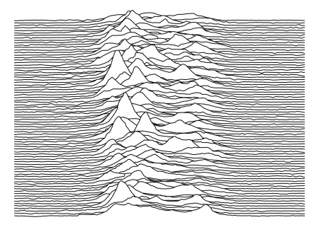
This visualization offers a more compelling narrative about the pulsar's emissions, appealing directly to both scientific understanding and aesthetic appreciation. By layering the data in such a manner, we can create a representation that captures the fluctuations in radio intensity over time, painting an auditory picture of celestial phenomena.
Refining the Aesthetic
For a more dynamic appearance, we can modify the colors and apply similar procedures using tinyplot:
pulsar2 <- transform(pulsar, measurement = factor(measurement))
# Custom plotting code to adapt the results from ggridges
With this customization, the output increasingly aligns with the visually striking Joy Division cover. Playing with colors isn’t just a stylistic choice; it significantly influences how viewers interpret data. A shift in palette can evoke different emotional responses, marrying scientific data with personal resonance.
Final Renderings
Ultimately, we achieve an impressive rendering fit for t-shirts or wall art:
col1 <- "black"
col2 <- "white"
ggplot(pulsar, aes(x = time, y = measurement, height = radio_intensity, group = measurement)) +
geom_ridgeline(
min_height = min(pulsar$radio_intensity),
scale = 0.2,
linewidth = 0.5,
fill = col1,
colour = col2
) +
scale_y_reverse() +
theme_void() +
theme(
panel.background = element_rect(fill = col1),
plot.background = element_rect(fill = col1, color = col1),
)
The final visuals pay homage to a cultural icon while showcasing the beauty within our cosmic measurements:
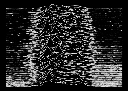
This artistic representation emphasizes the duality of science and art, presenting data that might otherwise remain imprisoned in spreadsheets as something accessible and even beautiful.
Implications and Future Outlook
By engaging with this dataset creatively, we're not just observing data but inviting an exploration of its aesthetic potential. For those in scientific fields, such artistic endeavors can forge connections that ignite further research and collaboration. As more data scientists become attuned to visualization as a crucial skill set, the lines between scientific data and artistic expression will continue to blur.
If you're working in this space, exploring the intersection of data and art could lead to fresh insights and methodologies that engage wider audiences. The implications here go beyond personal enrichment; they challenge conventions about how data can be perceived and presented.
In conclusion, this blending of artistic and scientific approaches to data opens up new avenues for interpretation and appreciation of what often appears as mere numbers on a page. It’s a reminder that even in the most technical fields, there’s always room for creativity. After all, science isn't just about the numbers; it’s about the stories they tell.